Case Study · Persustain
Designing a climate system you can hold in your hand.
Persustain was not simply a carbon-tracking app. Behind each user action sat a multi-layered system involving project aggregation, verification workflows, carbon credit generation, and value creation.
I led it end to end — designing the UX/UI, then building the front end and Firestore data layer myself. My job was to translate that system complexity into something understandable and trustworthy for everyday users, and to make it actually run.
The brief
At first glance, the project appeared to be a typical sustainability application where users log activities and track their environmental impact.
However, the underlying system was significantly more complex.
Individual activities contributed to projects, projects progressed through verification stages, verified outcomes generated carbon credits, and those credits ultimately drove community value and reward mechanisms.
Rather than designing isolated screens, the challenge became one question:
How might we help users participate in a complex climate ecosystem without requiring them to understand carbon-market mechanics?
Why carbon feels abstract
Early conversations surfaced a consistent pattern. Most people knew that driving, flying, or cutting energy use affected emissions — but almost none could explain what a carbon credit actually was, or how their individual actions connected to anything larger.
Meanwhile the system leaned on concepts like:
- Activity Data
- Verification States
- Evidence Packs
- Credit Lifecycles
- Reward Ledgers
There was a real gap between how the system worked and how people understood it. So the design problem shifted — from presenting data, to letting people participate confidently without needing any of that domain knowledge.
Key design question
What is the minimum mental model users need to understand their impact and trust the system?
Mapping the ecosystem
Before designing anything, I needed to understand the system behind it — so I mapped the whole thing out.
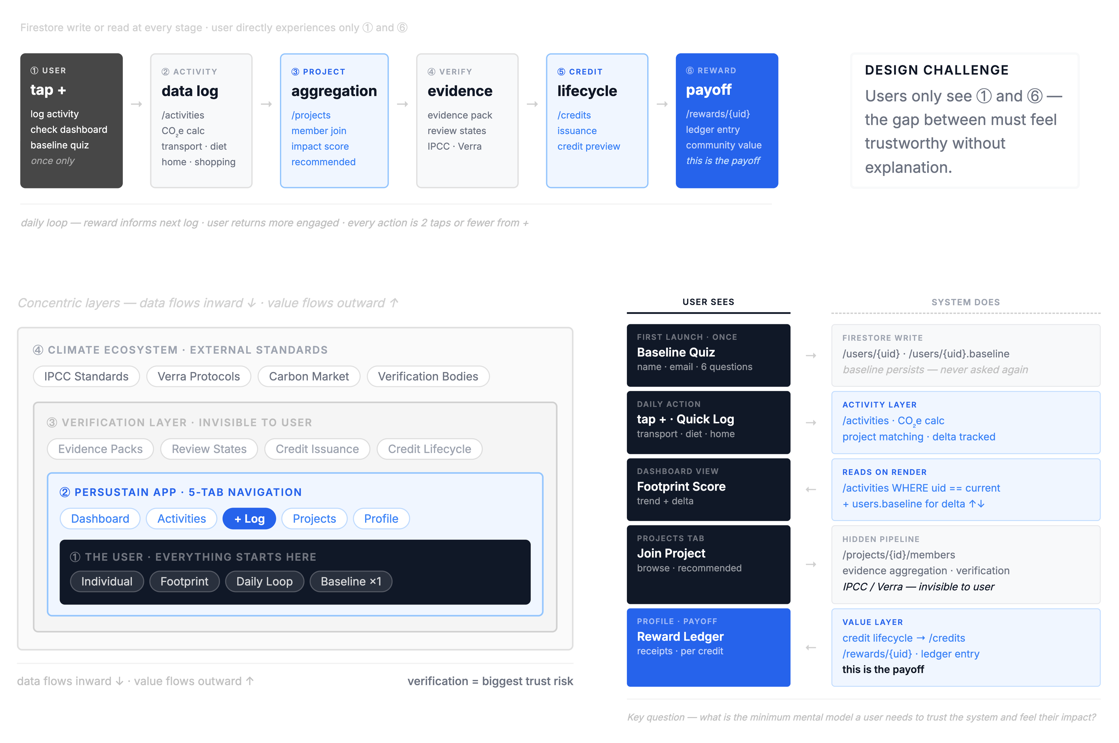
Ecosystem map — how users, activities, projects, verification, credits, and rewards relate.
Key insight
Users touch only a small part of the system. Most of the complexity — aggregation, verification, credit processing — happens out of sight.
That shaped the information architecture: instead of exposing every component, the experience centers on the user's own contribution, revealing deeper layers only when they're actually useful.
Defining the user's role
With the system on the wall, the question shifted from "what's in it?" to "where does the user actually live in it?"
Tracing the path across the six-stage lifecycle, the answer was clear: people stay near the top — logging an activity, checking the dashboard, occasionally opening a project they've joined. Almost no one ever needs the lower stages — registry status, certification, value realization. That asymmetry became the design strategy.
It gave me the principle behind every screen: don't hide the system — just let the user choose how much of it to see.
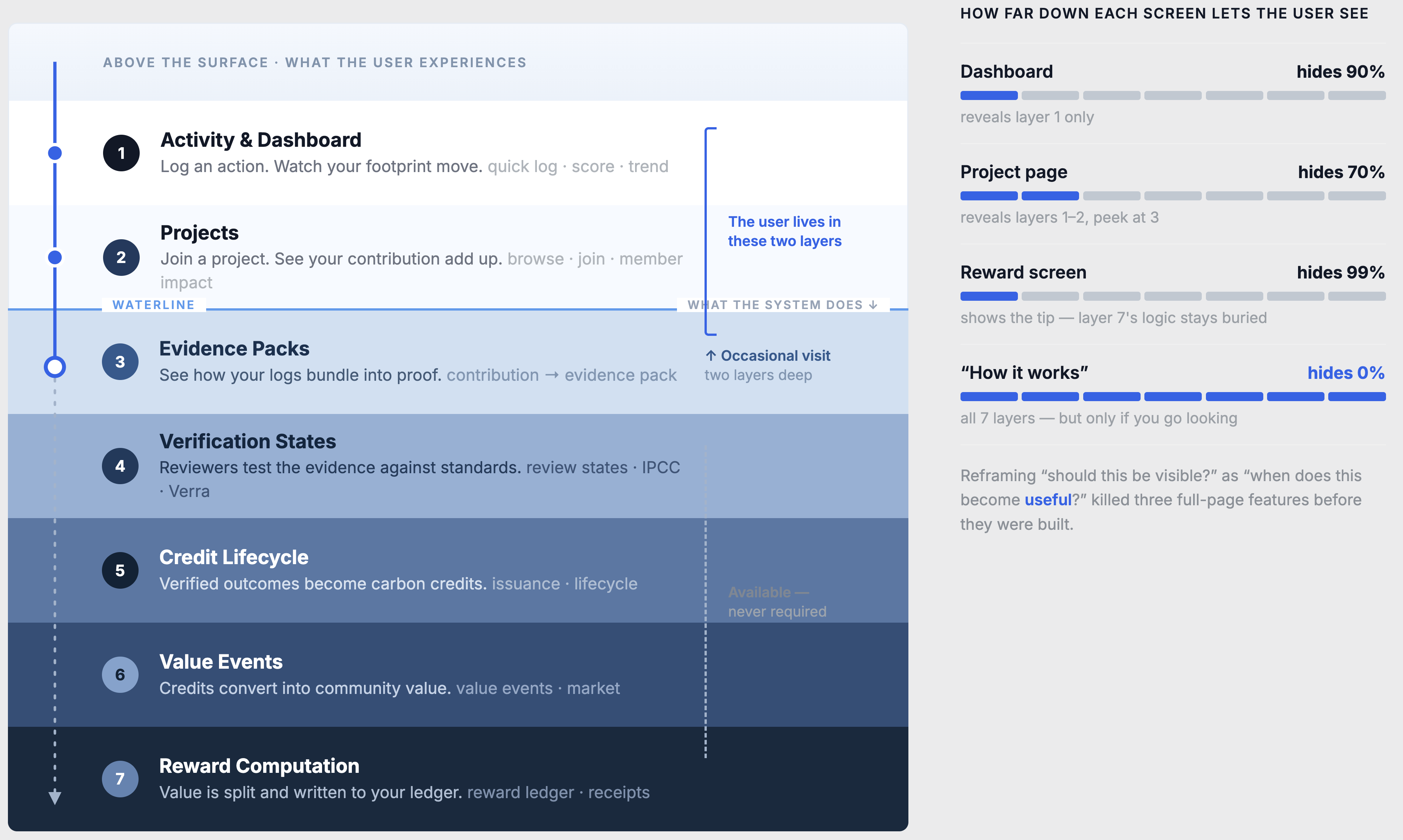
The user lives in the top two layers and visits a third on occasion. Everything below is available, never required.
The dashboard hides almost everything happening underneath; the project page surfaces a little more; the "How it works" explainer holds the full picture, for anyone who goes looking. So instead of asking "should this be visible by default?" I started asking "when does this actually become useful to the user?" — a small shift that cut several features I'd been about to design.
The real work wasn't designing screens. It was deciding what not to put on each one.
A lifecycle where every stage feeds the next
The system had to feel like one connected chain, not a set of disconnected screens. Under the hood, six stages hand off to each other in order:
I designed and built that chain in Firestore so each link actually triggers the next — real data, real state, not a slideshow.
How the chain runs
Onboarding writes a user's transport, distance, heating, and housing choices to their users document and computes a baselineCO2 — the reference point everything else measures against. Every logged action then lands in a Travel_log or Energy_log subcollection with a signed CO2_Kg value: positive when it adds emissions, negative when it avoids them (net = actual − avoided). Transport runs through the Climatiq API; home energy uses predefined factors.
On every dashboard load, a query pulls those logs, sums them against the baseline, and normalizes the result into the progress bar and percentage change. Aggregated totals roll up to the project level, where the lifecycle is tracked as four explicit state fields that advance in sequence:
- verification_status — collecting_data → verifying
- registry_status — not_started → submitted
- certificate_status — pending → issued
- value_status — potential → realized
When a user's actual footprint drops below their baseline and they've joined a project, the final link fires: a claim writes certificate_date and increments certificates_earned. The loop closes — an action at the top eventually returns to the user as an acknowledged contribution at the bottom.
The design problem inside the system
The chain is six stages deep — but a user should only ever feel four: their action, the project, its verification, and the value that comes back. My job was to keep the machinery real while keeping the surface simple.
The external layers — real verification bodies, registry integration, market issuance — are intentionally simulated and labeled as such. What's real is the internal structure: the collections, the signed calculations, and the state transitions that make the system behave like the product it's meant to become. (The AI layer — insight text, evidence-pack summaries — was built by a technical collaborator on top of this data; I owned the data model, aggregation, and lifecycle logic.)
Designing for trust
Before any visual polish, I worked the whole product out in lo-fi — deciding what each screen shows, what sits one tap away, and what stays hidden. The wireframes made the hard structural calls; the hi-fi work was about making those calls feel right.
Lo-fi — wireframes
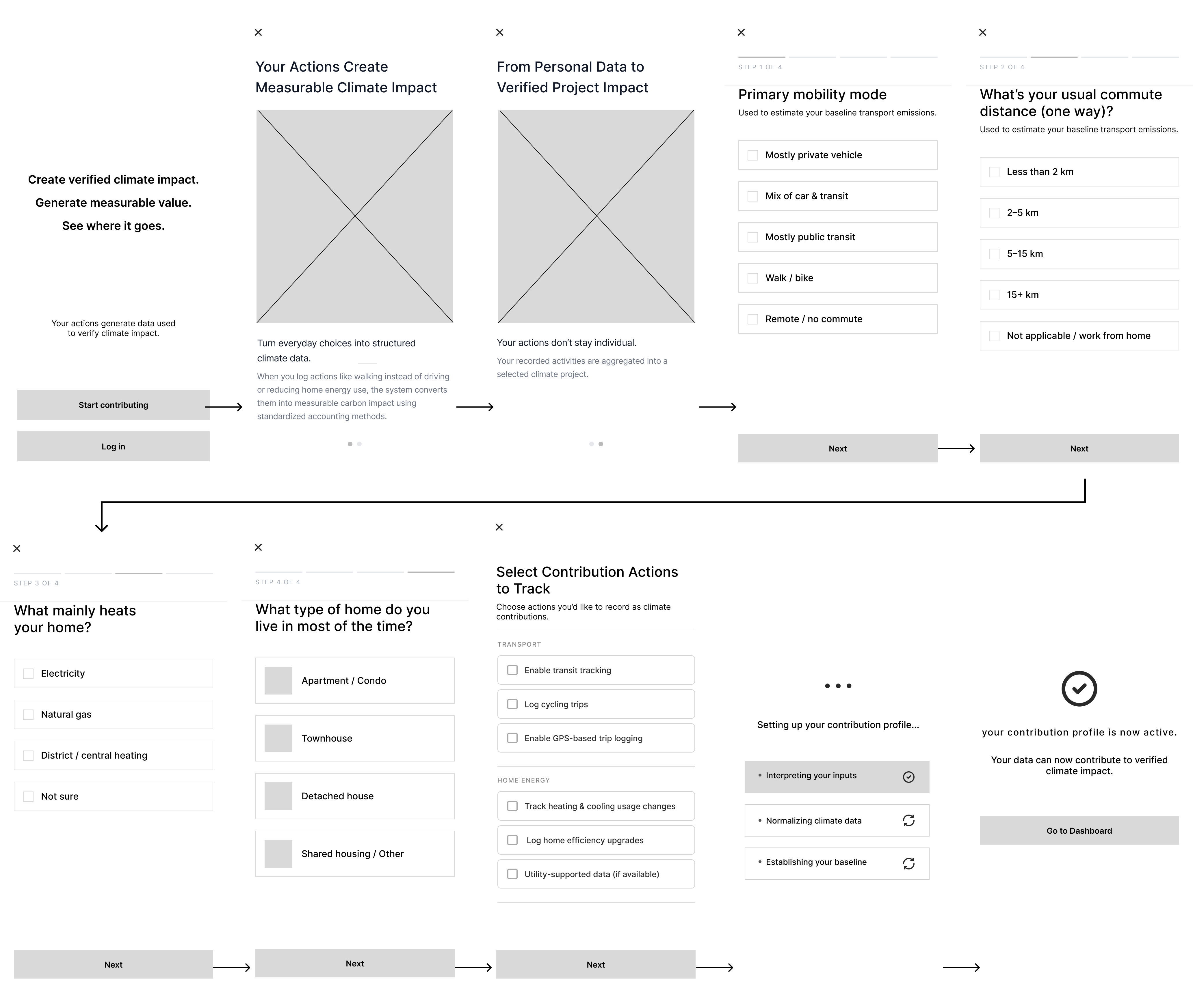
Onboarding in wireframe — entry, educational carousels, and the four-step baseline quiz. Structure and priority before any styling.
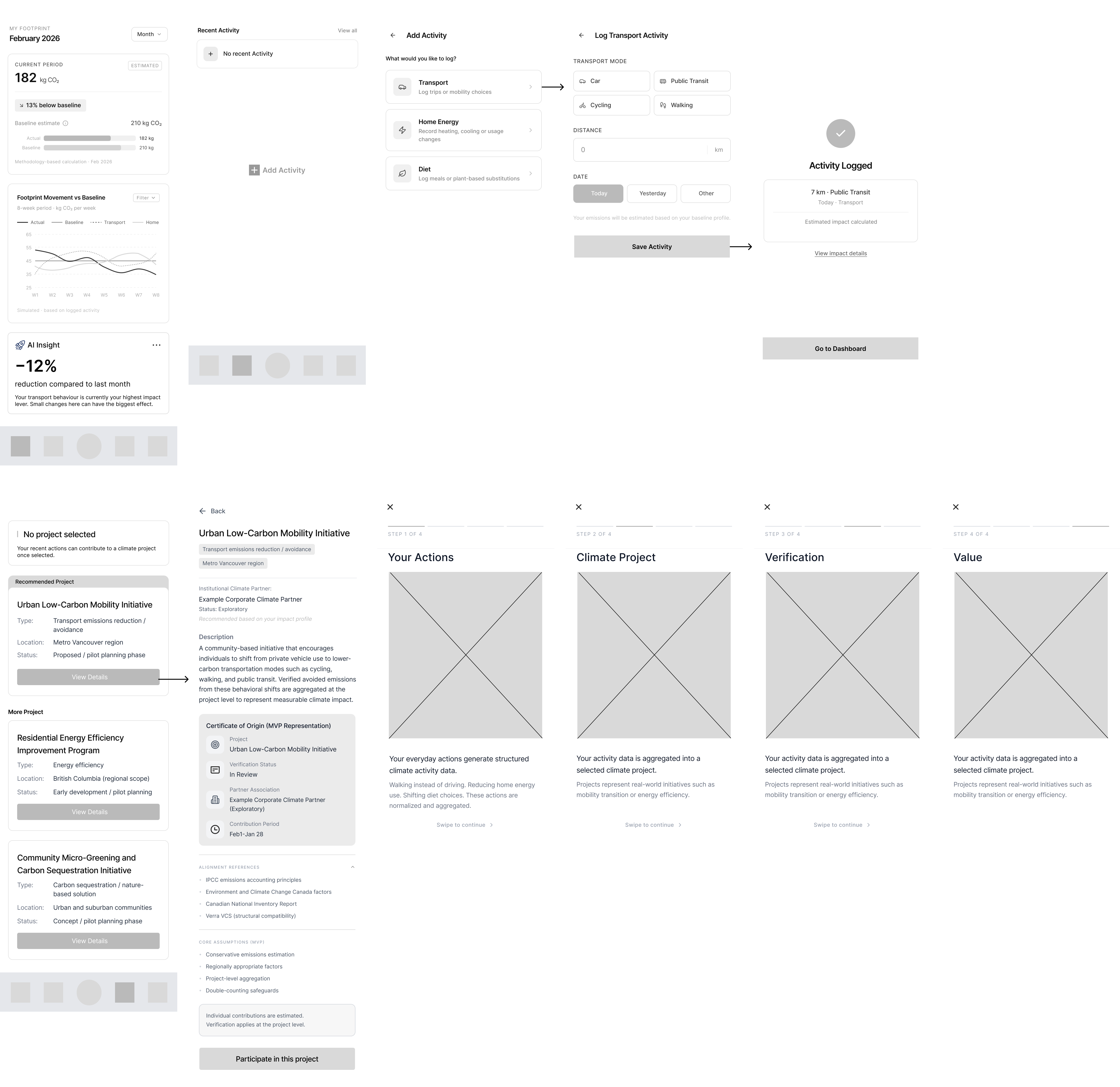
Core screens in wireframe — dashboard, activity log, projects, and the four-step "how this works" modal. Each validated for information priority first.
The principles that carried through
Most climate apps run on the same playbook: big numbers, red bars, streaks, leaderboards — a polite kind of pressure. I decided early that Persustain wouldn't. No shaming, no leaderboards, no "you're worse than 80% of users." Quiet turned out to be much harder to design than loud.
Two habits did most of the work.
Tell users what's simulated. Verification, credits, and value are real state transitions, but the market infrastructure behind them is stubbed — and every one of those steps is clearly labeled estimated or simulated, with methodology one tap away. The point was for users to know what's real before they found out the hard way.
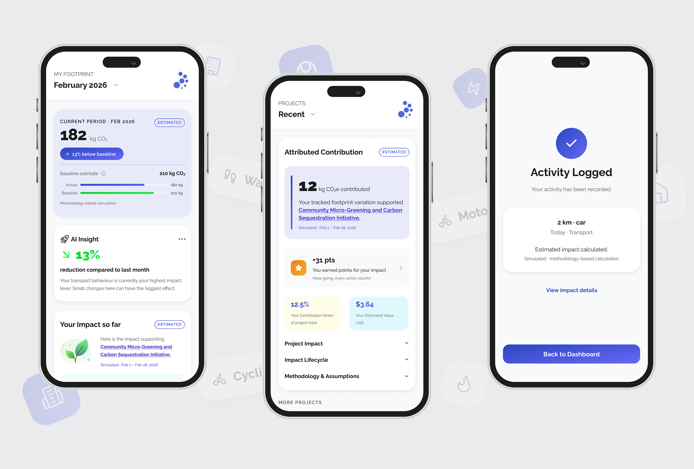
Reward without bribery. The contribution screen went through the most drafts. What shipped reads like a plain receipt — "12 kg CO₂e contributed · supported the Community Micro-Greening initiative." No confetti, no streaks. Just acknowledgment.
Hi-fi — a walk through the key screens
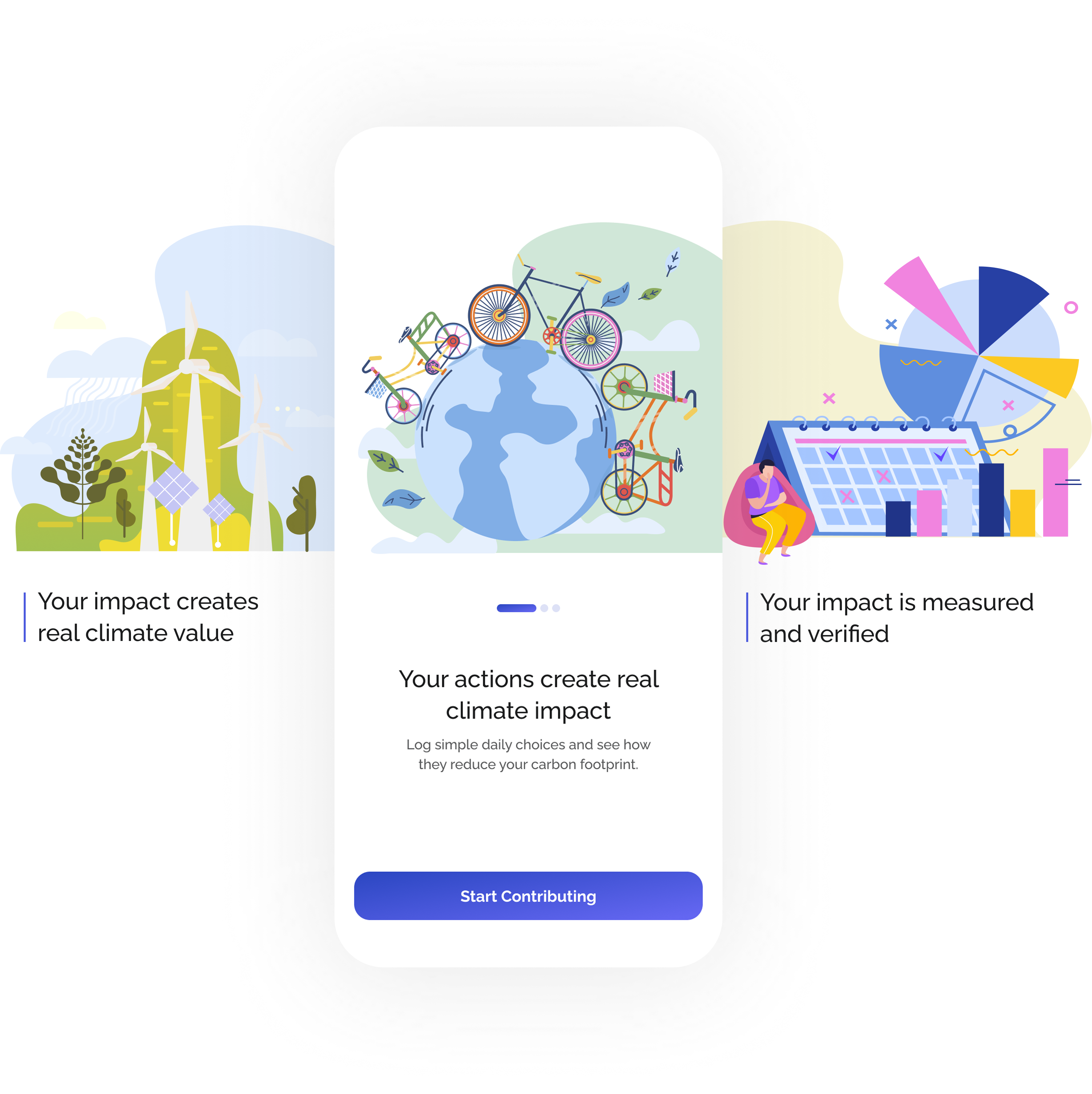
Onboarding
Three plain-language screens teach the four-step model before the user touches a single input — marked estimated, honest by default.
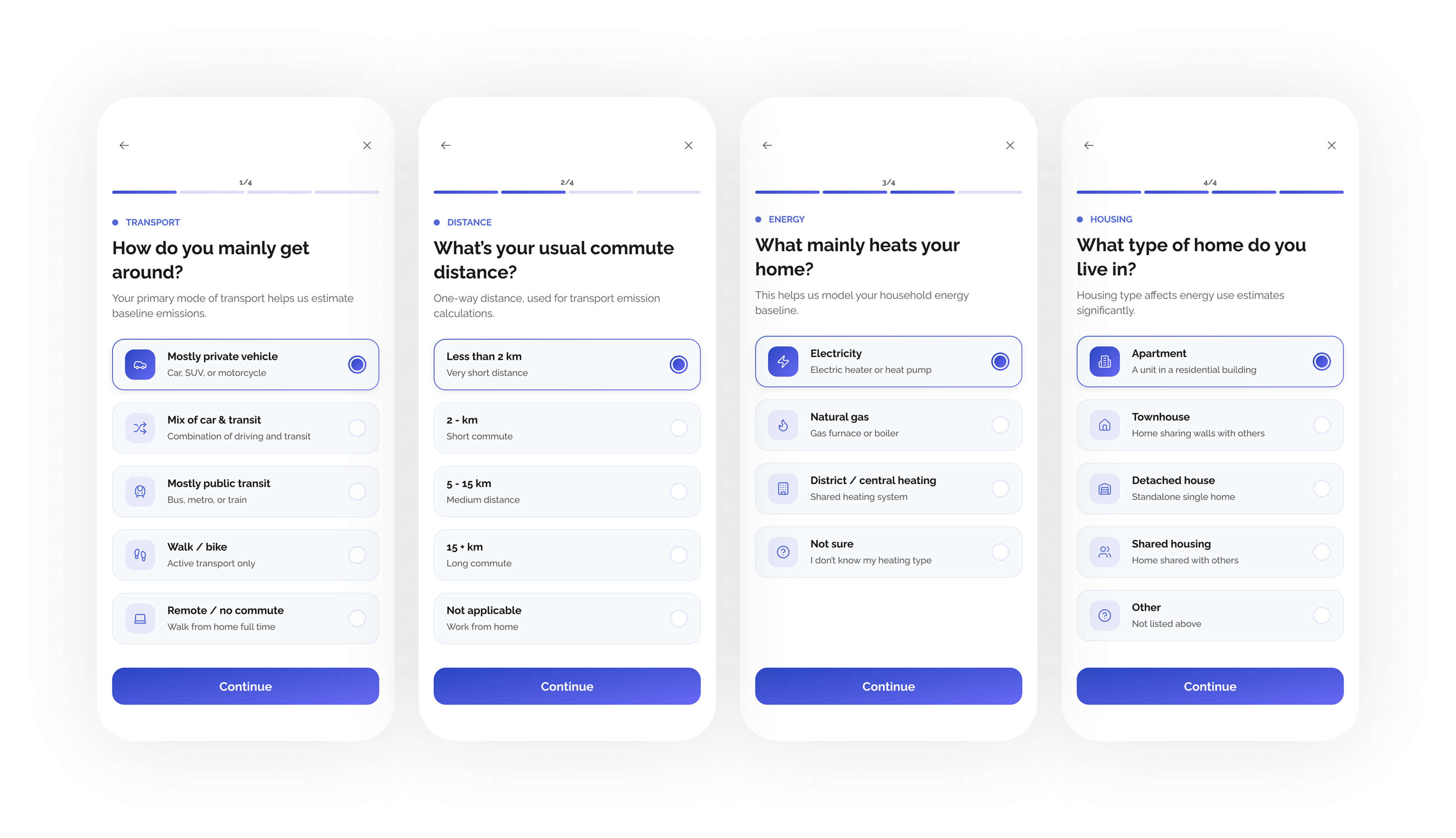
Baseline quiz
Four quick questions — transport, distance, energy, housing — that set the reference every future number measures against.
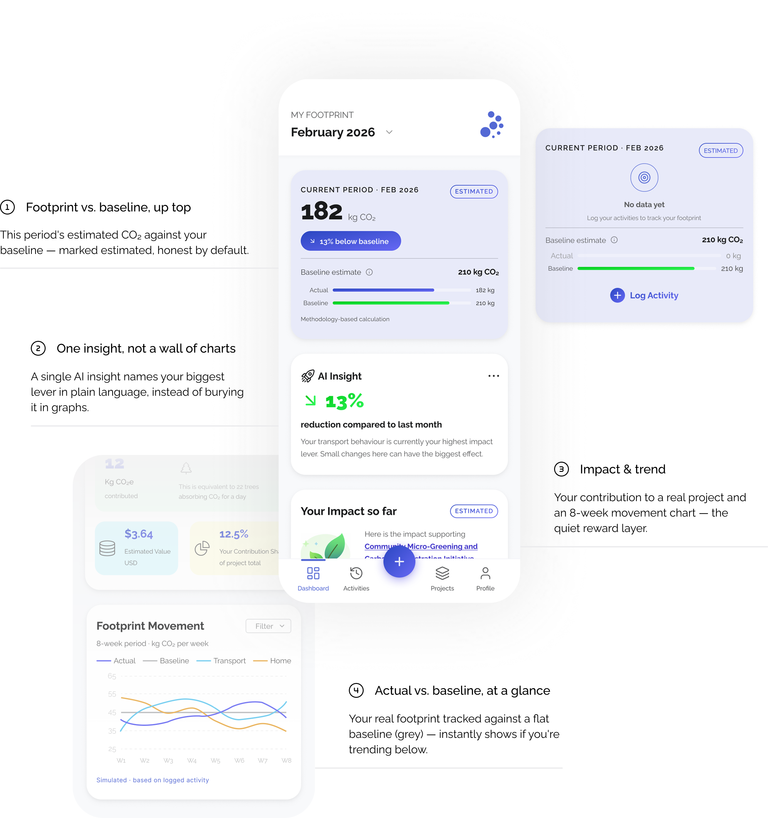
Dashboard
Answers one question first — am I below my baseline? — then lets the curious go deeper. Everything is labeled estimated.
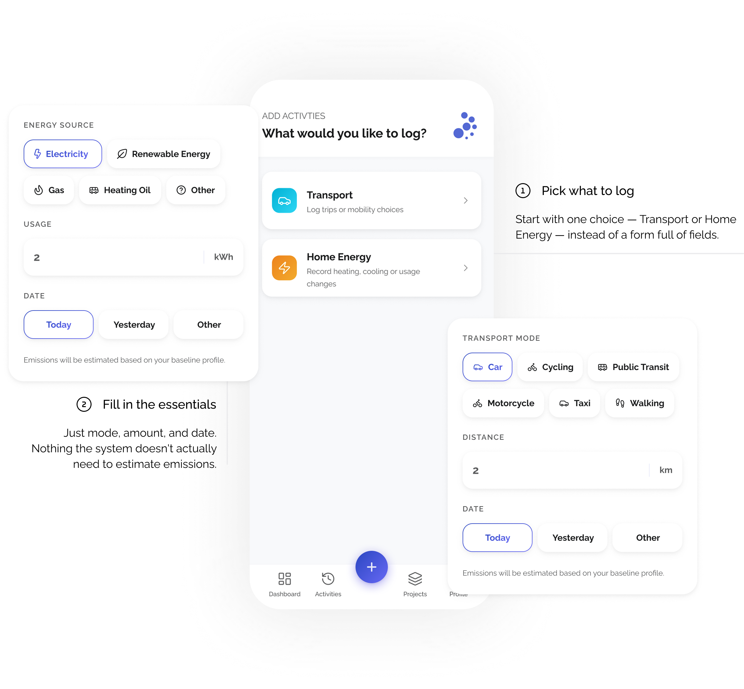
Log activities
Logging is two taps and a number — pick a category, enter the detail. Every estimate is tied to your baseline and clearly labeled.
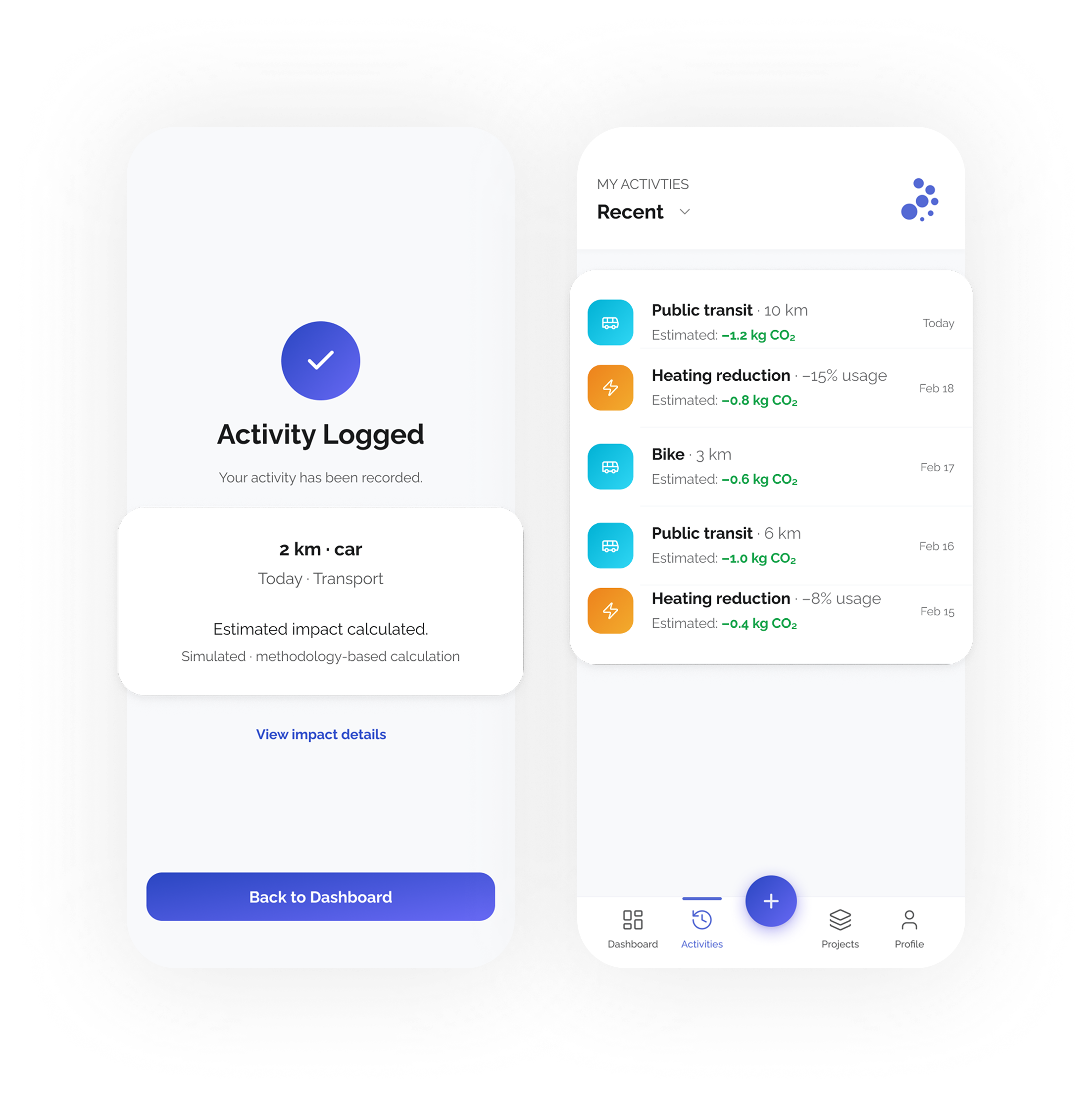
Activities
A calm confirmation, then the entry joins a running history — each log showing its own CO₂ estimate and date. Acknowledgment over celebration.
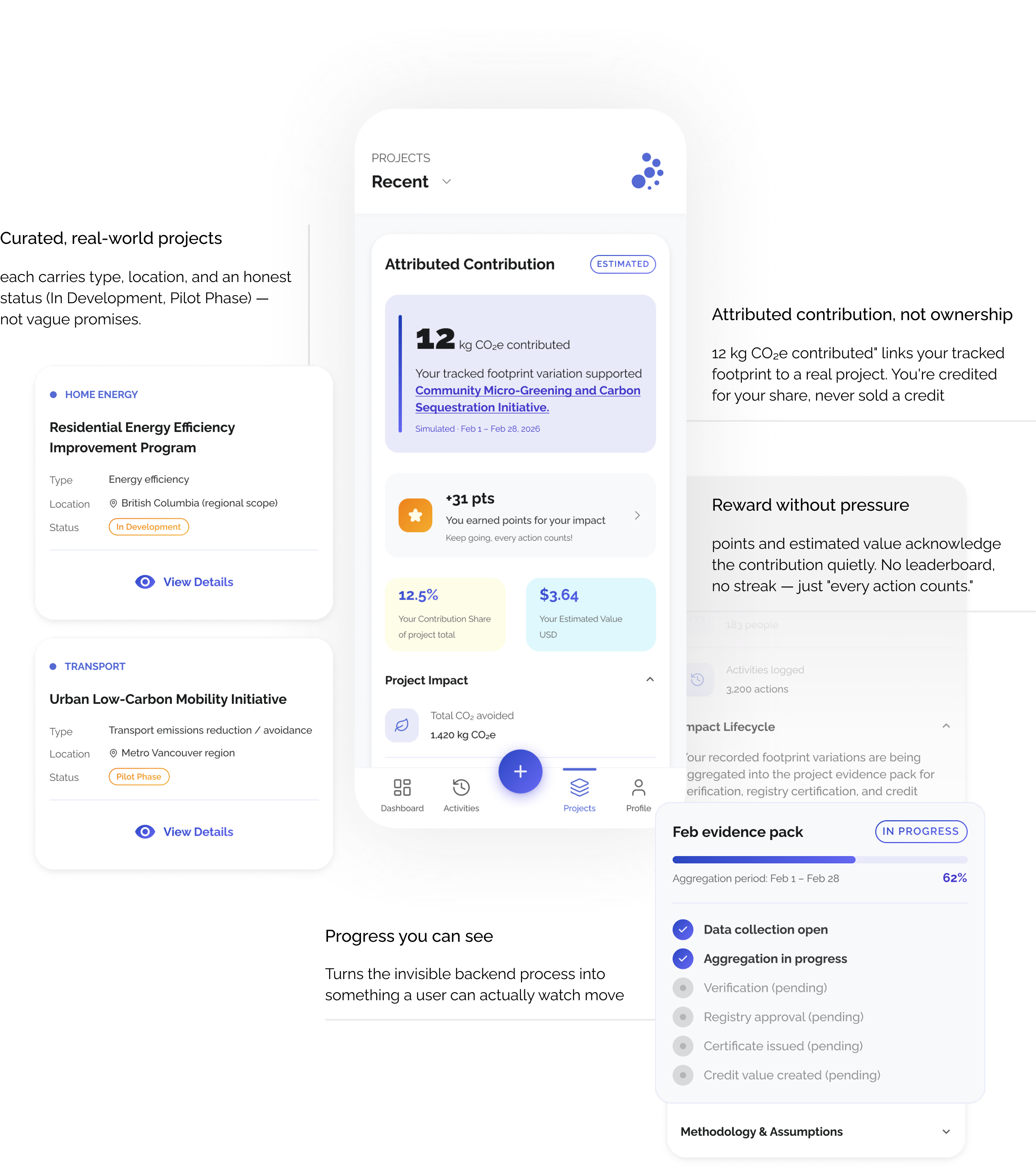
Projects
Curated real-world projects, each with an honest status, sit alongside your attributed contribution — a readable share and estimated value. The evidence pack fills toward verification, turning an invisible backend process into progress a user can actually watch.
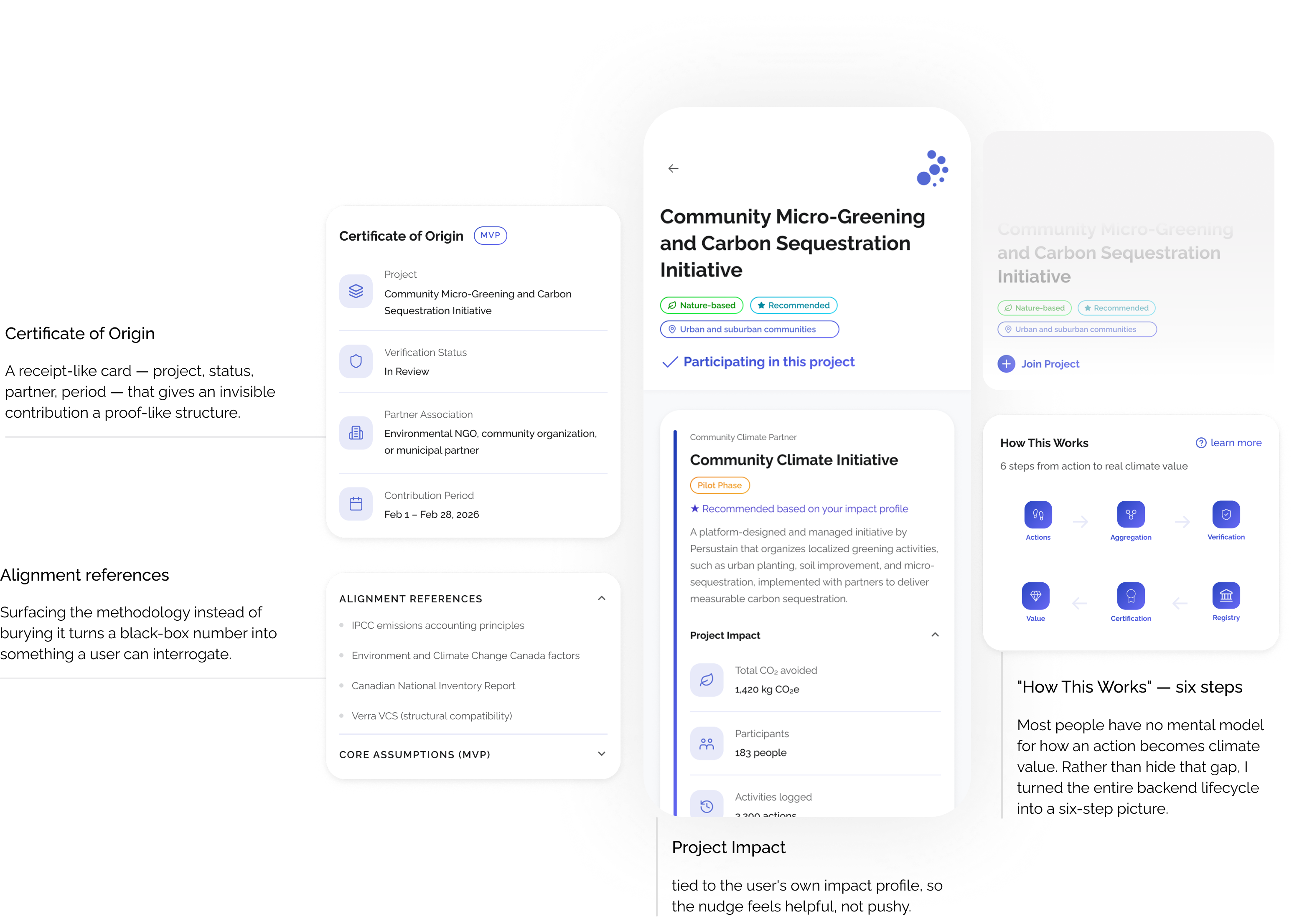
Project detail
Where the hidden system earns trust: a Certificate of Origin, the six-step lifecycle drawn out, and alignment references (IPCC, ECCC, Verra) that surface the methodology instead of burying it — every estimate labeled, nothing overclaimed.
Building it, not just designing it
A design that only lives in Figma proves you can draw. I wanted the harder proof — that the system actually runs. So beyond the UX/UI, I built the front end and the entire data layer myself in FlutterFlow + Firestore.
That meant designing the schema behind the product: a users document holding onboarding inputs and baseline, Travel_log and Energy_log subcollections for every action, a users_projects link when someone joins a project, and a project collection carrying the four lifecycle state fields. Each action writes a signed CO2_Kg; the dashboard queries those logs on load, sums them against the baseline, and normalizes the result into the progress bar and percentage change.
Working inside FlutterFlow taught me to design for what's actually buildable. A clean native-feeling card layout is nearly free; a fully custom interactive diagram is expensive. Knowing that cost while I designed meant I stopped drawing things the platform couldn't ship, and started shaping the experience around what it did well — real constraints, handled by the same person who drew the screens.
The parts that would imply real-world authority — external verification, registry integration, market issuance — are intentionally simulated and clearly labeled. That was a deliberate architecture decision: real internal state transitions, stubbed external infrastructure, so the system feels serious without overclaiming. The AI layer — insight text and evidence-pack summaries — was built by a technical collaborator on top of this data; I owned the data model, aggregation, and lifecycle logic that everything else reads from.
Technical demo
Under the hood — a logged activity persisting to Firestore, the query re-reading it on load, and the footprint recomputing against the baseline. Front end and data layer built by me.
What I learned
The MVP shipped as a working build — validated through internal testing across the full data flow, lifecycle transitions, and calculations. Formal external usability testing was out of scope for this phase, which itself shaped what I'd do next.
What held. The four-step model did its job: someone could follow their action into a project, watch it move toward verification, and see something come back. Keeping the six-stage system real underneath — actual collections, signed calculations, state transitions — made the whole thing feel like a product rather than a mockup.
What I'd change. I treated onboarding's baseline step as self-explanatory; in practice it's the most conceptually loaded moment in the app, and it deserved more design attention up front. And I designed the reward/contribution screen late — by the time I got to it, everything else was locked. Figuring out what the system gives back to the user, before deciding how they engage with it, would have made every earlier screen easier. I now design outcome screens first.
What building it taught me. Owning the data layer changed how I design. Once you've written the query that reads a log back and computes a delta, you stop drawing screens that ask for data the system can't cheaply produce. That's the way I want to keep working — design grounded in what it takes to build.
What's next. The roadmap opens the lifecycle toward real verification pathways, registry connectivity, and multi-project participation — turning the simulated stages into live ones. The architecture was built to extend into exactly that.