Furrytales Pets Website Redesign
This three-day Hackathon project focuses on redesigning the FurryTales Pet website to enhance user experience and brand consistency.
Role
UX Research, UX Prototyping, UIUX design
Tool
Figma
Time
Feb 2025 ( 3 days)
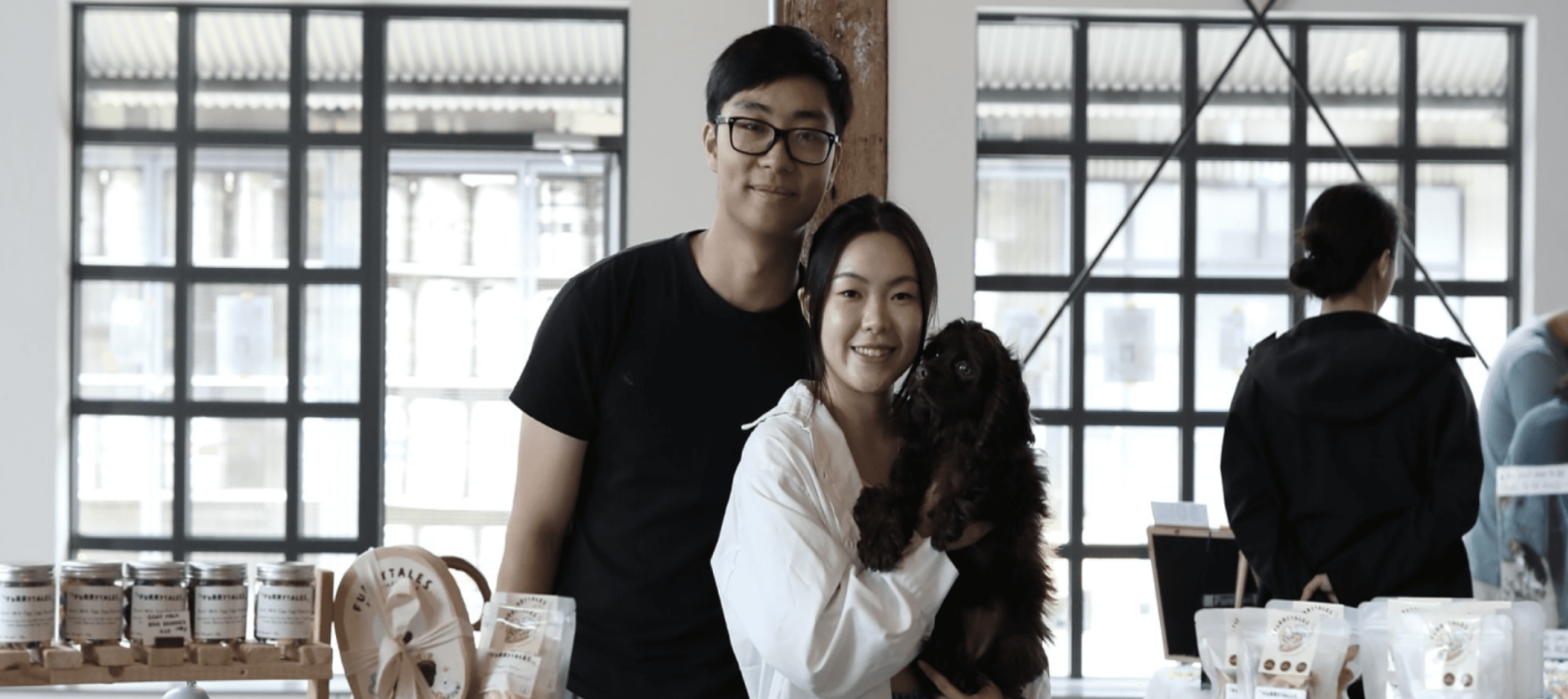
Team
Ziqian Wu; Ava Clark; Yelu Song; Joseph Kim
CHALLENGE
Our Client
FurryTales Pet is a specialty pet treat company that creates gourmet, small-batch dehydrated and fresh-baked treats for both cats and dogs.
What makes them stand out is their customizable treats, designed to meet individual pet needs, and their artistic approach, incorporating pet portraits on cookies, cakes, and other treats.
With a certified pet nutritionist leading the way, FurryTales Pet focuses on making pet food fun, healthy, and visually delightful, turning everyday treats into playful experiences for pets and their owners.
CHALLENGE
Project Overview
FurryTales Pet is redesigning its website to enhance user experience and brand consistency. The new site will be playful, professional, and easy to navigate, reflecting the company’s focus on healthy, customizable pet treats.
The Problem is…
FurryTales Pet's current website lacks a user-friendly experience and branding consistency.
How might we
redesign FurryTales Pet’s website to create a more user-friendly experience and ensure brand consistency while improving navigation, accessibility, and customer engagement?
research
Target Audience

Ages 20s-30s
Young adults who are financially independent and prioritize quality.

Influencers
Social media creators who showcase pet products and influence purchasing decisions.

Pet Enthusiasts
Friends of pet owners who like to give gifts to the beloved pets.
research
Competitor Analysis
FurryTales Pet is redesigning its website to enhance user experience and brand consistency. The new site will be playful, professional, and easy to navigate, reflecting the company’s focus on healthy, customizable pet treats.

These competitors feature single-ingredient, creative treats and often engage with customers through social media promotions, seasonal products, and influencer partnerships.
design process
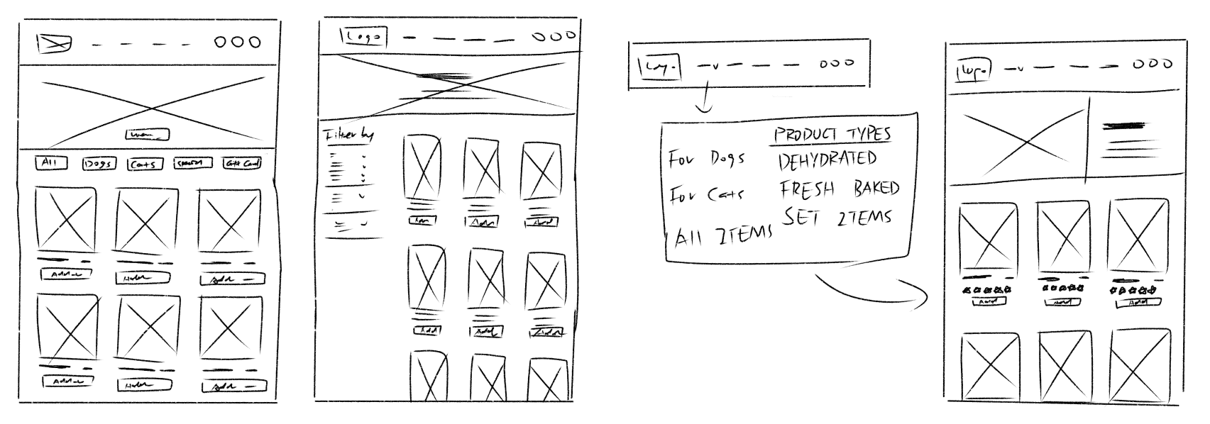
Low Fidelity
We primarily focused on the areas where the client needed the most design improvements, including the product page, subscription pop-ups, value proposition, and FAQ page.

design process
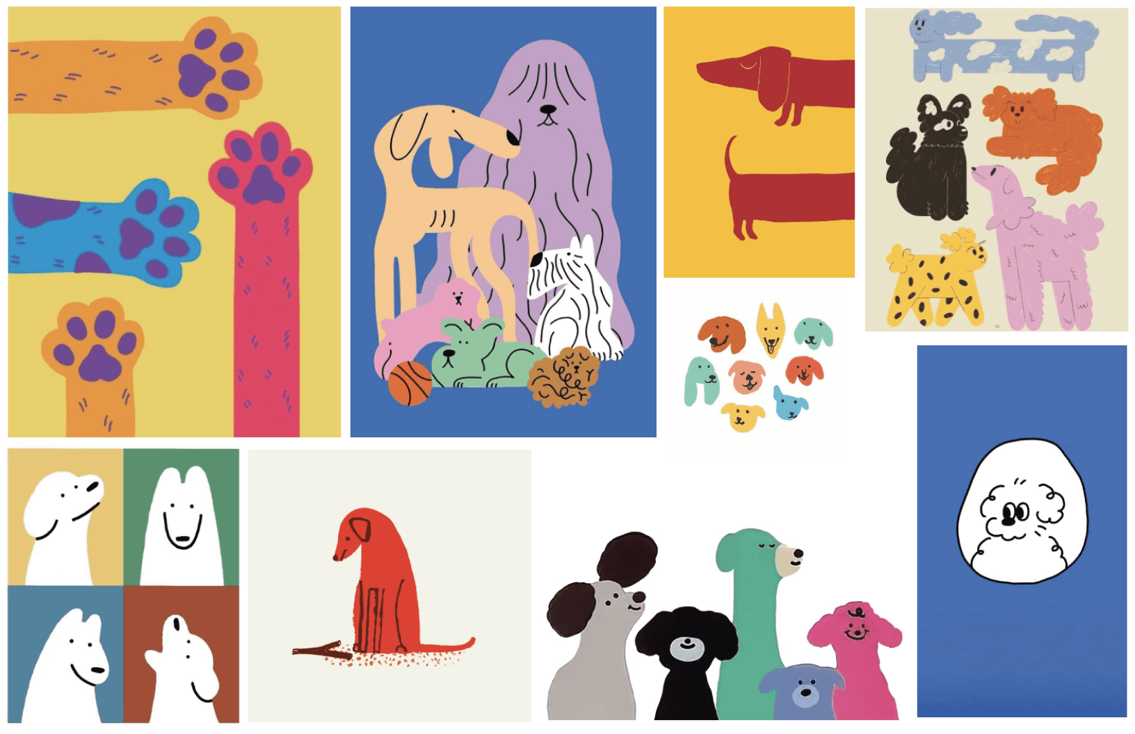
Visual Mood Board
To establish the visual direction, we created mood boards drawing inspiration from social media aesthetics, competitor websites, and brand personality.
Moodboard Concepts:
Instagram - Inspired Vibrant colours
illustrative elements, and clean typography for a playful yet modern look.
Photo & Line Art Mix
Combining real pet images with line art to create a dynamic, engaging layout.
Minimal & Bold
Focusing on line art and strong typography for a clean, high-impact aesthetic.
design process
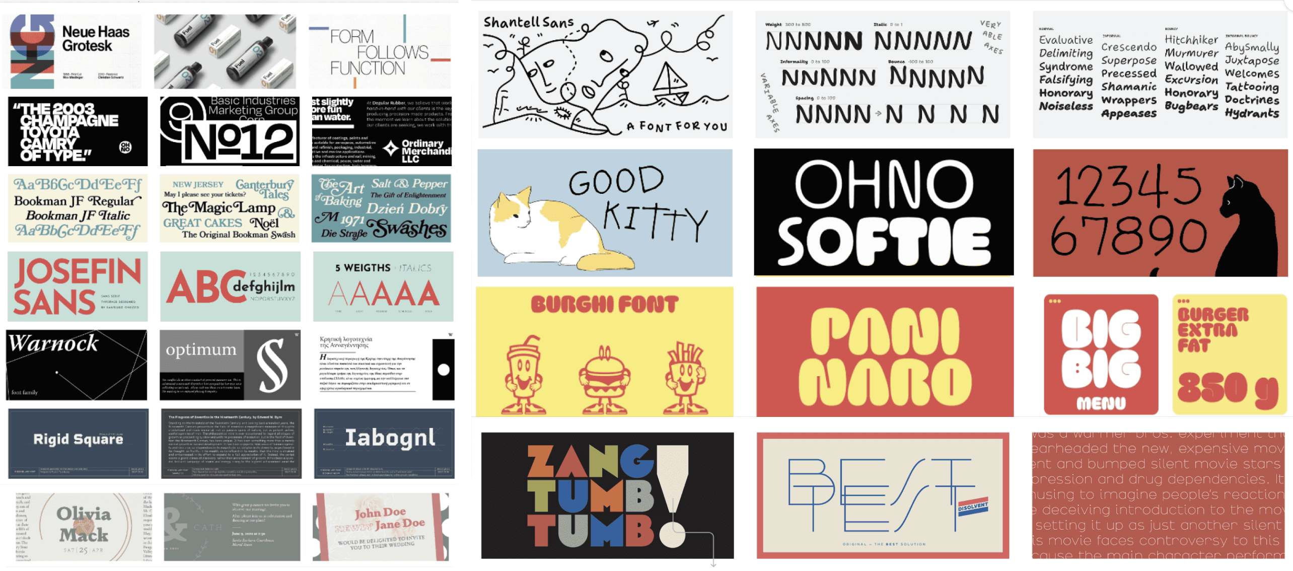
Typography Mood Board
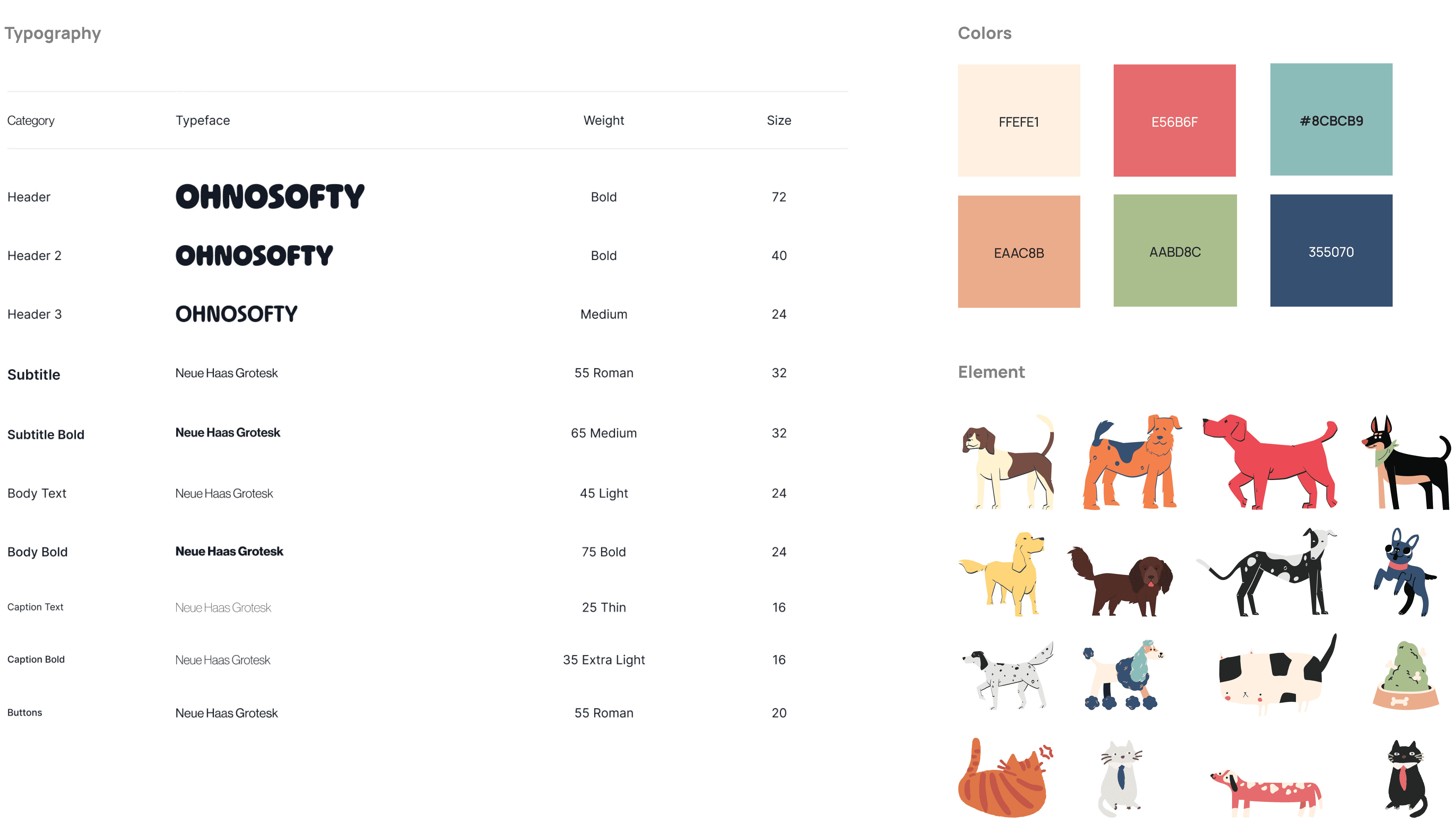
After researching design trends on Pinterest and Behance, we observed many modern pet brands use bold, vibrant typefaces paired with simpler, contrasting fonts.
Key Considerations:
Primary Typeface
Eye-catching but not overwhelming, highlight key content.
Secondary Typefaces
Strong sans-serif or serif fonts to create balance and readability.
Colour Pairing
Works well with the brighter, playful colour palette.
our solution
Testing & Validation
We conducted with user testing with a puppy-owner and graphic designer who provided refinements to the UX copy and visual consistency of the site.
Insights:
Color Consistency
Color usage needs to feel more intentional, use brighter colors to highlight actions of importance and reflect brand values.
UX Copy
Change language to speak to audience with more personality and a real human touch.
User Flow
Change organization of page “banners” and increase spacing between subjects to allow users processing time between one idea and the next.
our solution
Final Design
Home Page
Before
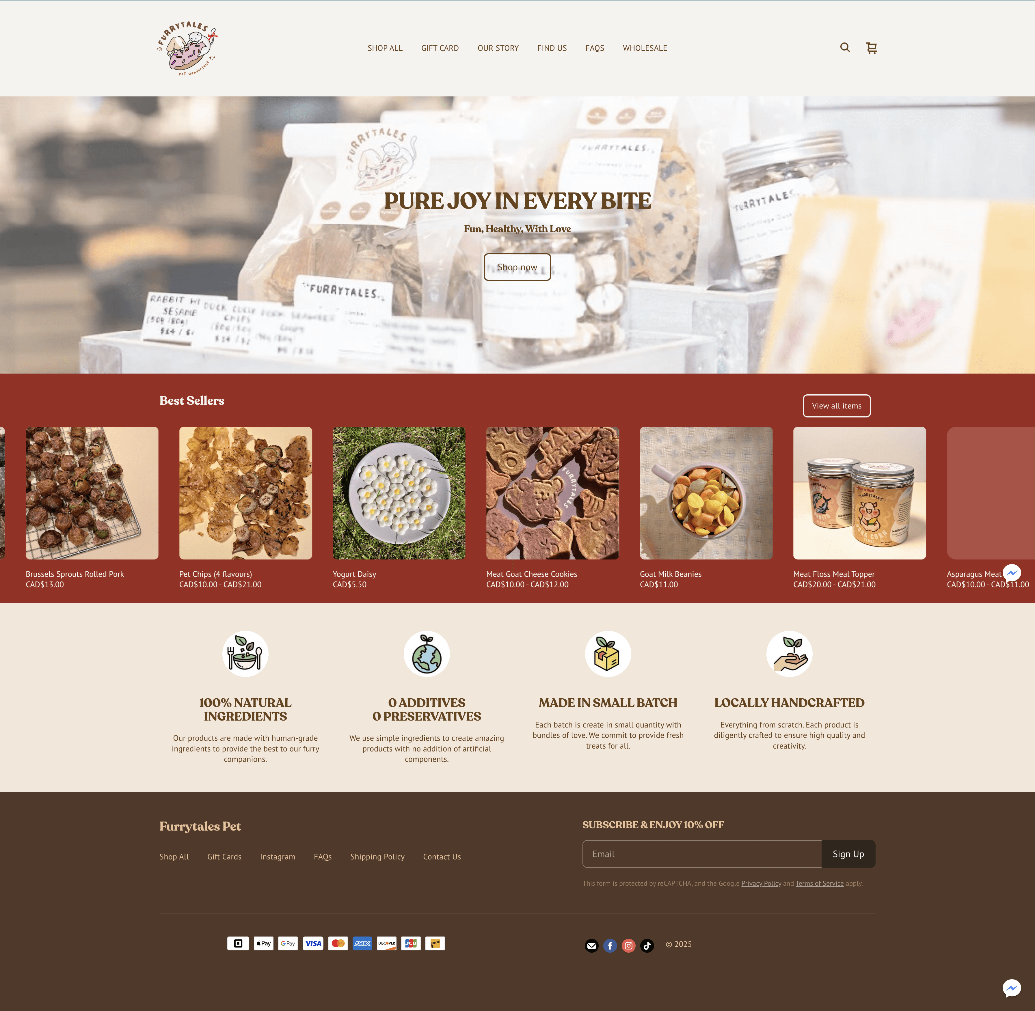
The design felt minimal but lacked playful branding elements.
After
The new design improves navigation with separate sections for cat and dog treats, adds customer reviews, and enhances the "Our Story" and FAQs pages. Playful illustrations strengthen brand identity,

Product Page
Before
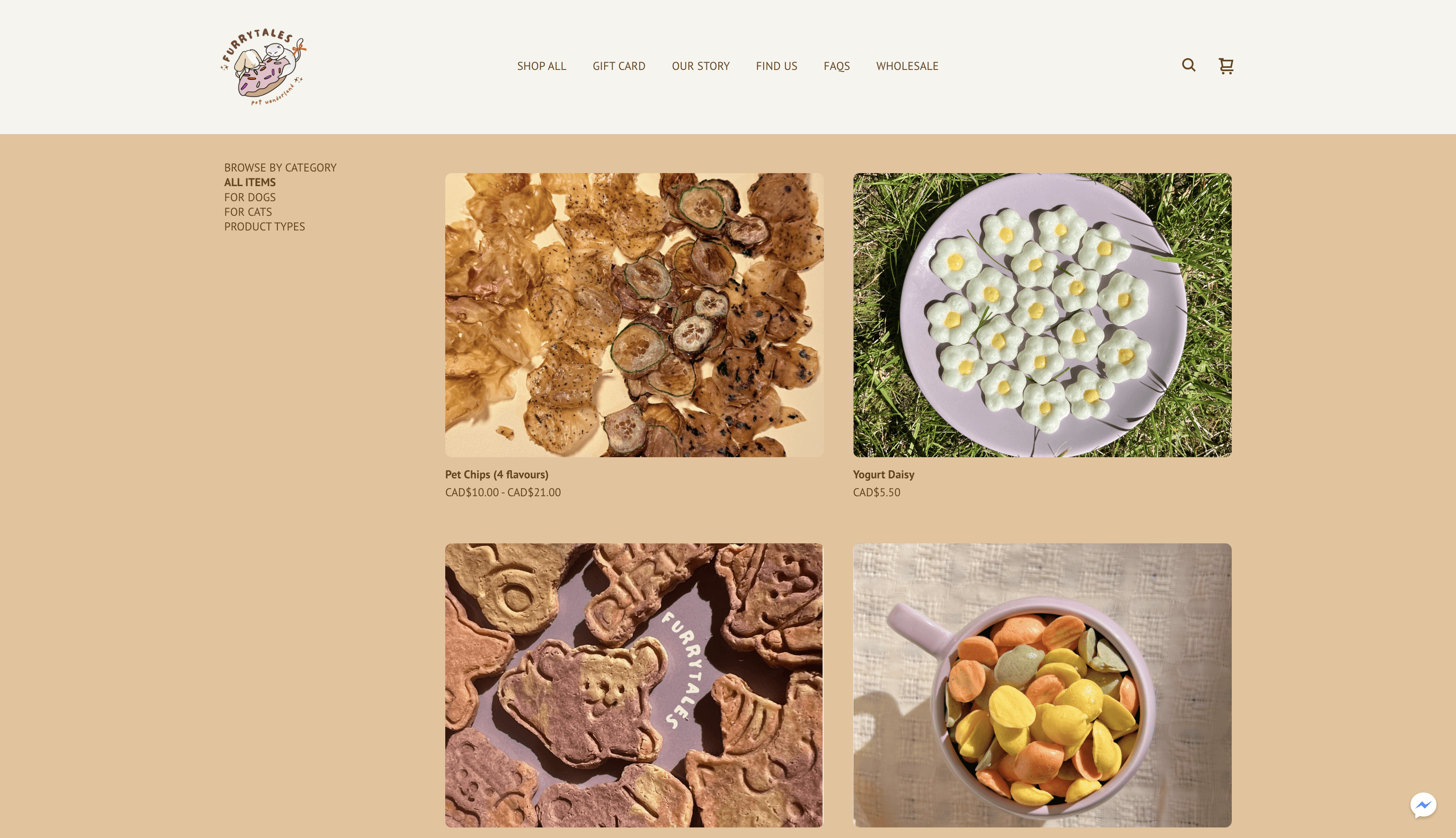
The product page lacked clear categorization. The images were unappealing, failing to create a strong purchase desire. The overall layout felt unpolished and not professional enough.
After
The new design enhances the filter system, making it easier to find products. Each product now has a border for better visual structure, and new, high-quality images make the treats more enticing. The improved layout looks more professional, organized, and engaging for shoppers.

Our Story
Before

The layout felt a bit rigid, with too much text that might overwhelm visitors. The design lacked a playful, engaging visual style that reflects the brand’s personality.
After
We refined the layout, making it more visually dynamic and illustration-driven. The text was condensed to highlight key messages more effectively, creating a friendlier and more engaging storytelling experience.

Contact Us & FAQ
We standardized the layout for a cohesive look across both pages, reinforcing the brand identity. Playful illustrations were added to enhance visual appeal, while high-contrast colors improved readability, making key information stand out clearly.

design process
Design Systems
After researching design trends on Pinterest and Behance, we observed many modern pet brands use bold, vibrant typefaces paired with simpler, contrasting fonts.